Responsive Subtitles [1] are an approach to subtitling that adopts techniques used in responsive web site design. The traditional approach to formatting subtitles uses fixed size blocks of text displayed for set periods of time, which although is sufficient for a standard television set up is far from ideal for immersive displays and 360o video.
We have been conducting experiments, which enable the subtitles to be formatted by the display in order to fit both its own capabilities and the users preferences. Using ‘atomized’ subtitles where the timing for each word is known and creating the subtitle blocks on the fly achieve this. This means that the block can be formatted to any shape or size and to give the user a completely customized experience.
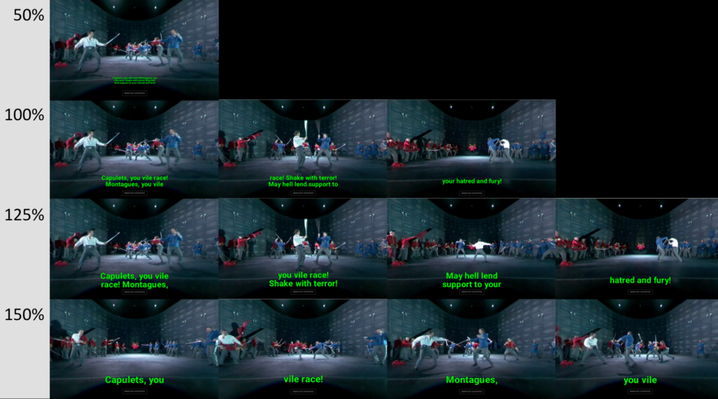
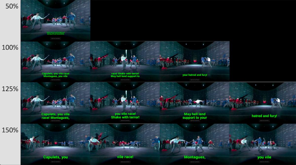
Subtitles are re-blocked by adhering to the number of characters that can fit into the display container at the chosen font size. Firstly each paragraph is recombined, based on a unique speaker. A best-fit algorithm then breaks each paragraph up to individual captions in order to fit the container. Due to the nature of the changing font size this may provide more or less captions than the original subtitles, however as the number of words is remains the same the reading speed never changes. As words are evenly distributed it also avoids leaving orphaned words. The image below demonstrates how the same subtitles can be presented differently when the user chooses a font size of 50%, 100%, 125% and 150%.

[1] Chris J Hughes, Mike Armstrong, Rhianne Jones and Michael Crabb, Responsive Design for Personalised Subtitles, In 12th Web for All Conference, ACM, Florence, Italy, May 2015


